Santosha Living

About the client
Our client is passionate about Yoga, healthy eating, conscious living and personal growth. They wanted a website that helped create opportunities to empower people by helping them gain knowledge and acquire skills in order to achieve the best version of themselves, mind, body and spirit. They work with people of all ages, all abilities and from all walks of life. Offering 1:1 sessions, public classes and workshops to individuals, as well as with local councils, GPs, schools and charitable organisations.
The challenge we faced
Our thoughts
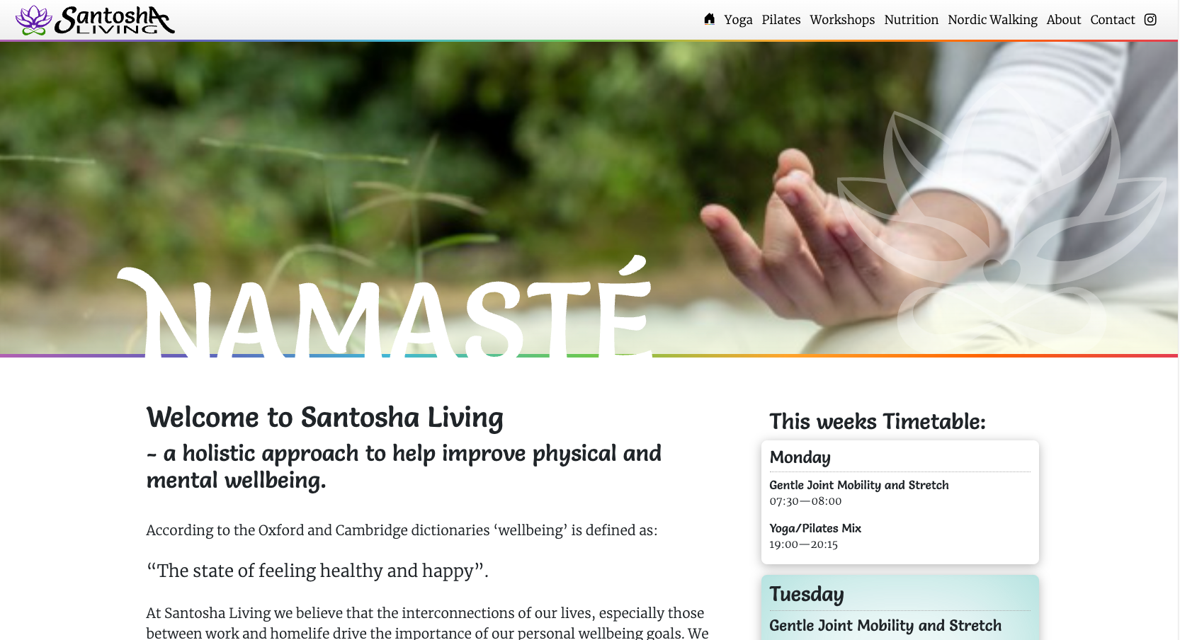
The client wanted to showcase the wealth of wellbeing services they had to offer. They wanted a modern, crisp and cool feeling website that echoed the feeling of a Mediterranean beach retreat. It had to convey lots of information in an easy to understand, friendly way while demonstrating serious professional knowledge that the owner was able to provide.
This resulted in the following action plan:
- Create a CMS backed, easy to update website
- Create a wellbeing focused brand
- Create a clean and crisp look and feel for both
- Design and create assets for use on merchandise / stationary / online
Our proposition
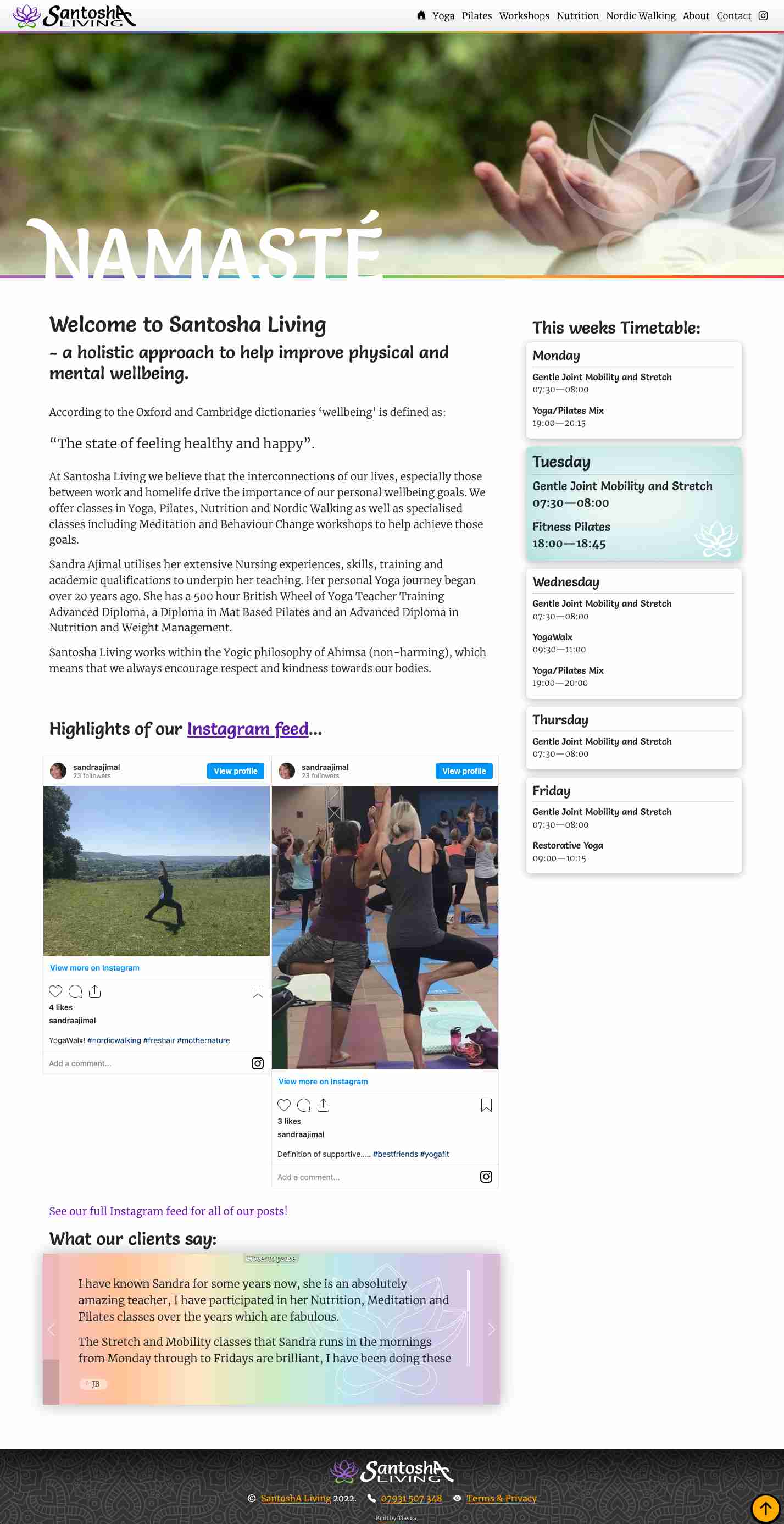
Careful use of Shakra colours offset with a very pale main colour avoided 'gaudiness' and helped promote a Mediterranean 'beach yoga retreat' feel to the site. Each sub page helped to demonstrate benefits of each therapy and showed how holistically, they all worked together.We achieved that by:
- Separating each section out into an easy to understand hierarchy
- Showing a a glance what each courses focus was for that day
- Allowing quick and easy information requests per activity
Santosha Living - The results speak for themselves:
The design

Why is this better?
- Clean, professional yet bright colour palette
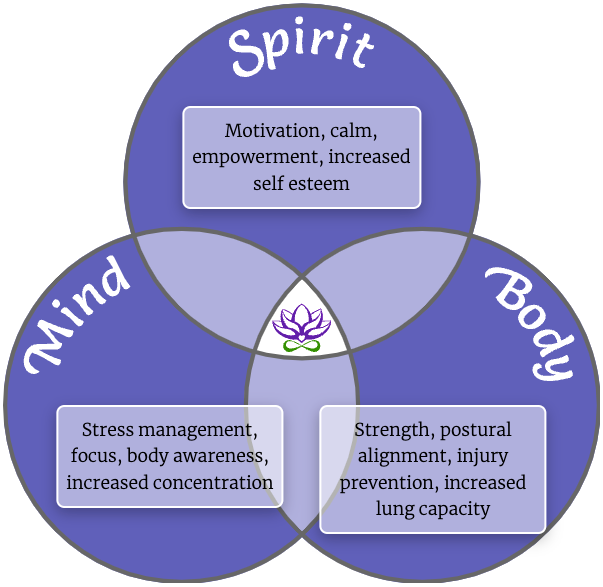
Simple explanations of core principles

Why is this better?
- See how this 'fits' holistically with other therapies
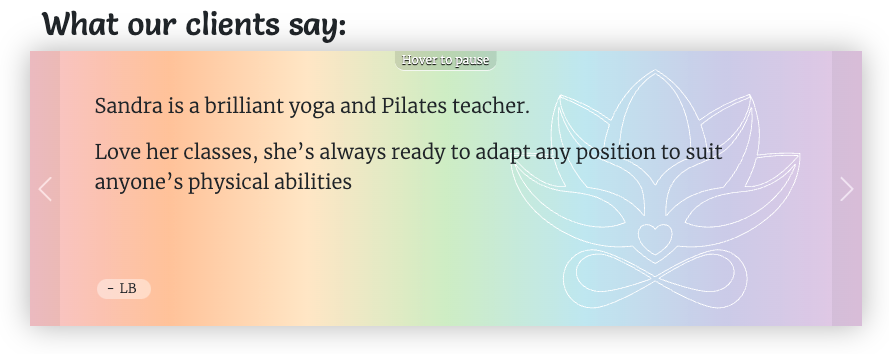
Full testimonial system for feedback

Why is this better?
- A bright treatment of feedback
'Funky' ethnic theming throughout

Why is this better?
- Bespoke designed lotus flower motifs and batik patterns